Tuesday, 20 December 2011
Shape of my Main Task magazine
After repeatedly looking at the same old rectangular shaped magazines, I decided that I want my magazine to be of a different shape. I feel that if I am to grab my target audience then I need to draw away from the same shaped magazines as everyone else and create something so different that it stands out and makes the target audience want to buy my magazine rather than the same shaped ones as everyone else. Another way that I could change up the layout of the magazine is to change from portrait to landscape.
Logo for the Main Task

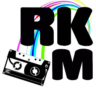
This is my logo that I created for my main task; it was produced on Photoshop. I first decided to play around with the font. I knew straight away that I wanted an informal font which would play on the fact that the magazine is for an age group of teenagers. I went through all of the fonts that were available and this one struck me immediately. It had a playful yet formal look to it which makes it able to be taken seriously and appeals to most teens.
Once the font was chosen I had to come up with the name of the magazine. From Analysing the magazines I found out that they use a simple name with either one letter like Q or a simple few letters such as NME which sound good together. Few of the magazines used long words like KERRANG. After looking at the magazines I decided to use the three letter idea. I felt it was an effective way to keep it short and make it stand out. I then found it really hard to come up with what three letters I was going to use so I went back to looking at my questionnaires. One of the most popular genres was rock; this information allowed me to use this to my advantage. I took the word rock and abbreviated it to RK. After repeatedly saying the letters out loud, I concluded that this sounded good but needed an extra letter to complete it. The next obvious letter was M for magazine. This completed the name of the magazine, RKM. The letters flow of the end of your tongue and is easy to say.
After finding the right font and name for the magazine I typed the letters separately allowing me to move them each freely without them being in one line. I really like the way that Q magazine uses a square around the letter so I wanted to recreate this in a different way on my magazine. I played around with the three letters and as you can see from the above I created a square like shape. However, I felt that there could be something else added to make it seem as though it was part of the music magazine. This was when I added the cassette image. The image was black and white which made it link to the text but I felt that it could do with something else to link it. It needed colour.
I decided that the cassette had to have the tape inside it coming out wrapping around the text somehow to make the two images link. This was hard but I came up with the idea of just one curve coming from the cassette to the K. This made it look like the tape was coming out of the cassette and wrapping around the letters. I wanted some sort of colour to be added as this is what the age group like. They are drawn into colour. This was the final element to the logo and as you can see from the image above the colour finished the logo nicely. I will be using this on my main task.
Subscribe to:
Comments (Atom)