Friday, 30 March 2012
Errors that have occured
After speaking to my teacher, it became apparent that my cover, contents and double page spread analysis was not to the correct standard. The images I have used were from the Internet and not of my own therefore in order to stop myself from loosing the research I have already done; I will now add a few more magazines of my own to add to the research.
Monday, 5 March 2012
Step by step Double page spread


the first image shows how the orginal image was. I felt the writing on the wall wasn't neccessary and needed to be removed. I used a brush to paint over the writting. I then dublicated the border and put it in front of the image; this made the whole thing look like this, ready for the writing and other images.

the next picture I added into the double page spread was the image that represented the story I was going to write on the page. The Writting is about Bethany Marsh who has brought out a brand new album called "Trapped" I wanted to show how the images and the story relate therefore descided to create an image that linked to the album. The name of the album is Trapped so I wanted to make the image have this theme. I came up with a few idea but I really wanted to complete this one because it showed of my photoshop skills. I first started with a photoshoot of Bethany. I got her to hold a mirror and then took a few photos of this. the next photos I took were different. I put Bethany back into the position she was in whilst taking the first shots; but this time I got my sister to put her hand around Bethany's head. This then made the image in the mirror look very disturbing and as if she was being "trapped" by someone or something. after taking a few shots of the whole scene I took the images into photoshop. I chose the best image for the first shoot and then the best for the second. I put the first image into photoshop and then layed the second image over it. I then took the cutting tool in a faded edge brush and selected the area of second image I wanted. in this case I selected the mirror area. I then inversed the selection. This made everything but the mirror reflection selected. this was then cut out. I was then left with the first images and only the reflection of image two. after this, I took the second image and made it fit inside of the reflection of the first image. This then made it seem as though Bethany was seeing something different than was actually there.

Before I created the first image I tried it out using an apple. I was pleased with my results so therefore went ahead with the editing of my final image. This is the image below.

After I had created this image I started to play around with the different levels of opacity this meant that I could make the different images appear to be more visiable than others. I put both the images together and merged them by using a blending brush to blend out the harsh line between the two images this made it look like this.

This image was then ready for the text. I decided to write out the story before I placed the text on the images. This made it easy to edit and improve. After I had applied the text it looked like this.


I descided that because my images were black and white that I would keep to this theme and make the text black.
Friday, 2 March 2012
Contents
As my magazine has been divided into what is being sold in shops and what is going to be online; I have decided that although on the back of the front cover there will be a few points that are in the magazine, I will create a contents which outlines most things in the magazine. This means that I will have 4 pages to create; the front cover, the back of the front cover, the contents and the double page spread.
Monday, 20 February 2012
Producing the final idea


I started off with this image and the logo. I felt that the image was too orange so I decided to change this on another draft. I then decided that the I didn't want the QR code and bar code on the front of the magazine so devised the back of the front cover that will be sold in shops. It makes the magazine look neater and well layed out. This is shown in the images above.
QR code

Pre-evaluation review
Write a paragraph that describes your project
my project combines the idea of a magazine and media online. It is a updated version of a magazine that uses QR codes to scan and view on an Ipad, Iphone and or IPod. It creates less waste products which is good for the environment. My magazine will try to target the market of teens with the idea of using their everyday appliances.
What is unique about your project?
My project is designed for Ipad, Iphone and or Ipod use. It Has a QR code which allows it to be scanned and viewed online.
What technologies are you using?
I am using photography, photoshop, I may use a Wacom Tablet, as well as this my project will be online.
Reflect on progress so far and challenges/areas where you struggle
My work is going at a good pace but still needs a lot of work however all research is done.
What still needs completeing?
My double page spread and contents need completeing.
Friday, 10 February 2012
Final ideas
I've come up with the ideas and now it's time to put them into action. The idea is that the front cover is going to be sold in shops along with the back of the front cover that shows some of the contents of the magazine in the style of a calender and a description of how to get the magazine. The shape of the magazine is going to be an Ipad. I have decided to get a sponsorship with apple, to increase profits and advertisement. It also stops the copyright issues with the magazine cover that is sold in shops. The front cover has included the Ipad because it shows the market that this magazine is to be enjoyed online through your Ipad, Iphone, or Ipod.
The QR code on the back of the front cover that is sold in shops is bought and then you can scan it. For now to show how it works I have created a QR code that when you scan it, directs you back to this blog. To stop people from scanning the code off of the shelves of the shop, I will devise the code to be covered by a silver coating that you have to scratch of before you can scan it. The whole of the cover will then have to be covered in plastic or an Eco friendly material to stop people from scratching off the code.
The QR code on the back of the front cover that is sold in shops is bought and then you can scan it. For now to show how it works I have created a QR code that when you scan it, directs you back to this blog. To stop people from scanning the code off of the shelves of the shop, I will devise the code to be covered by a silver coating that you have to scratch of before you can scan it. The whole of the cover will then have to be covered in plastic or an Eco friendly material to stop people from scratching off the code.
Monday, 30 January 2012
Price of my magazine
After getting my questionnaires back and looking over them it was apparent that people would pay around £2 - £3 there were few who chose the option above this so therefore I can not put my magazine price higher than £3 as people will not buy it. most of the magazines that already exist are around this price category, such as kerrang which is £2.10. I have decided that I will price my magazine as £2.50 as it is in between this price group. I want to gain a profit however I would like to make sure that my target market is able to buy it.
Friday, 27 January 2012
Genre of my magazine
I have decided that the genre of my magazine will be a rock magazine. This was determined from the questionnaires that I handed out to people. The most popular choice was rock. I will have to show this genre when creating this magazine, so I will research what is needed for my magazine to be of a rock genre.
Friday, 13 January 2012
A few ideas put into action
The first picture is the main image I took that I will then manipulate into my front cover. As you can then see, in the second image I took out the screen so I can put my front cover in it. I then further went onto put my logo in to see how it looked. This can be moved later if needed. These are all drawn to scale.


scale of ipad

NEW IDEA
I have decided that the shape of my magazine is going to be the shape of an ipad. This shape will be the border of the ipad with my front page on the place where the screen would be. I will be selling only the front cover in shops and you will be able to buy this front cover with a QR code which will enable buyers to scan the code with their smart phone and get the website where my magazine will be presented. This allows me to not only keep up the growing trends of technology but to help commit to being environmentally friendly rather than wasting paper that magazines are printed on. with this idea I will have to research to find out if people would like this product and if they were willing to buy this magazine. I will survey and ask people and I will present this research on here.
Thursday, 12 January 2012
Continued shape of my main task magazine
I have been thinking about the shape of my magazine and I have decided that one of the shapes that I could produce is the "ipod" shape. It is a well regonised shape throughout all ages and has potential to strike my market audience and portray a new look on magazines. If I am going to produce this shape I feel that I should keep it to the real life size of an ipod or round about that size. Although, this may cause it to be lost in the shelves of other well known magazines.
Tuesday, 20 December 2011
Shape of my Main Task magazine
After repeatedly looking at the same old rectangular shaped magazines, I decided that I want my magazine to be of a different shape. I feel that if I am to grab my target audience then I need to draw away from the same shaped magazines as everyone else and create something so different that it stands out and makes the target audience want to buy my magazine rather than the same shaped ones as everyone else. Another way that I could change up the layout of the magazine is to change from portrait to landscape.
Logo for the Main Task
This is my logo that I created for my main task; it was produced on Photoshop. I first decided to play around with the font. I knew straight away that I wanted an informal font which would play on the fact that the magazine is for an age group of teenagers. I went through all of the fonts that were available and this one struck me immediately. It had a playful yet formal look to it which makes it able to be taken seriously and appeals to most teens.
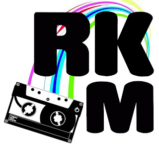
Once the font was chosen I had to come up with the name of the magazine. From Analysing the magazines I found out that they use a simple name with either one letter like Q or a simple few letters such as NME which sound good together. Few of the magazines used long words like KERRANG. After looking at the magazines I decided to use the three letter idea. I felt it was an effective way to keep it short and make it stand out. I then found it really hard to come up with what three letters I was going to use so I went back to looking at my questionnaires. One of the most popular genres was rock; this information allowed me to use this to my advantage. I took the word rock and abbreviated it to RK. After repeatedly saying the letters out loud, I concluded that this sounded good but needed an extra letter to complete it. The next obvious letter was M for magazine. This completed the name of the magazine, RKM. The letters flow of the end of your tongue and is easy to say.
After finding the right font and name for the magazine I typed the letters separately allowing me to move them each freely without them being in one line. I really like the way that Q magazine uses a square around the letter so I wanted to recreate this in a different way on my magazine. I played around with the three letters and as you can see from the above I created a square like shape. However, I felt that there could be something else added to make it seem as though it was part of the music magazine. This was when I added the cassette image. The image was black and white which made it link to the text but I felt that it could do with something else to link it. It needed colour.
I decided that the cassette had to have the tape inside it coming out wrapping around the text somehow to make the two images link. This was hard but I came up with the idea of just one curve coming from the cassette to the K. This made it look like the tape was coming out of the cassette and wrapping around the letters. I wanted some sort of colour to be added as this is what the age group like. They are drawn into colour. This was the final element to the logo and as you can see from the image above the colour finished the logo nicely. I will be using this on my main task.
Thursday, 15 December 2011
Double page spread analysis
Kerrang Double page spread
 I like the way that this double page spread uses black and white images. This allows the text to stand out against the grey scale background. The text is red which stands out as it links to the bands style. The band uses the colours red, white and black and I like the way that this is represented in the spread. The page has used a images with a black background and the way that it uses this to its advantage draws me in. It takes the image and blends it by making one of the side completely back and the other with the image. One dislike is the use of the white bar in the right hand corner; it distracts the eye of the reader and takes away the focus of the article. There are more images than text which makes me ask what will my audience want. I will have to come to some conclusions by analysing my questionnaires.
NME double page spread
I really like the title that this magazine uses. Its very bold and makes the strory look interesting to read. It grabs the reader in and helps add the feel to the magazine. This magazine also uses the images background to use on the other page which means I may have to think about this with creating my own.
MOJO double page spread

The way that this image is in black and white really appeals to me as I like the whole feel of it having no colour and really just seeing the image as its self. Another thing that makes me interested in this magazine is the tittle. I like the way that the text picks out the main words and puts them in a different colour. This makes them stand out against the black background.
Q double page spread

I really like the way that this magazine has used a gigantic L that covers the whole page for the first letter of the article. It stands out and draws you into reading the magazine. This magazine uses a picture on the left but doesn't make it appear to be part of the article on the right. This makes it different from any other magazine.
Vibe double page spread

This magazine appeals to me in the simple fact that it is pure creativity; being an art student I am looking to be very creative in creating my magazine. The idea used of drawing onto the person adds a feeling of him being part of the article. The tittle is very bold as it has used a handwriting style. This magazine will be one of my favourites to take ideas from.
Thursday, 1 December 2011
Questionaire results
Quetsionaire research

After getting back all of my 30 questionnaires I decided that to collate my findings I should put them into graphs. I decided that a pie chart was the most easiest one to read. This is only 4 of the 10 questions I asked. I found out that there was more males than females, however there was roughly half and half. I then discovered that my main age group would be the 15-16 one as I surveyed more of this age group. the next question was what type of music magazines do you usually buy? this allowed me to find out that most people chose the option other. however the second top choice was kerrang. this information shows that I may need to analyse different magazines. This was also the case for how often do you buy magazines? many people said that they didn't buy magazines on a regular bases therefore i will have to think about this when I create my own.
Tuesday, 29 November 2011
MOJO magazine
MOJO magazine

The MOJO magazine was like the others and used the colour scheme of red, black and white. I really like the way that the image is black and white and the titles are in red because it makes the sub title stand out. I also like the way that the image doesn't have any writing over it apart from the name of the magazine really appeals to me as it makes the image seem to be very important rather than being hidden by text. I think the font of the "Michael Jackson" links very well to the story. Michael Jackson was very popular in his childhood and this is shown through the old writing tape that both i and older generations would associate with as an old retro theme.
The contents of the magazine is very unique and I like this. by putting the pictures in a collage like way carries the theme from the front cover into the mag. when I was younger a scrap book was in every ones homes. the theme of the tape is also repeated onto the contents page.I like the way that the MOJO is very bold and is in black because it makes it stand out.

The MOJO magazine was like the others and used the colour scheme of red, black and white. I really like the way that the image is black and white and the titles are in red because it makes the sub title stand out. I also like the way that the image doesn't have any writing over it apart from the name of the magazine really appeals to me as it makes the image seem to be very important rather than being hidden by text. I think the font of the "Michael Jackson" links very well to the story. Michael Jackson was very popular in his childhood and this is shown through the old writing tape that both i and older generations would associate with as an old retro theme.
contents

The contents of the magazine is very unique and I like this. by putting the pictures in a collage like way carries the theme from the front cover into the mag. when I was younger a scrap book was in every ones homes. the theme of the tape is also repeated onto the contents page.I like the way that the MOJO is very bold and is in black because it makes it stand out.
Friday, 18 November 2011
Logo ideas for preliminary task

Tuesday, 15 November 2011
Logo
I cant use the school logo due to copy right issues and I feel that I could make my own logo look extremely better; it will also give me a chance to practice for my main task. Seeing as though I took art at both GCSE and AS I feel that I should bring this element into my media work. This gives me the availability to look at both planning my magazine and creating logos. To create my logo I will have to think about what it is my magazine is about and then draw ideas from this. To include the skills I have learnt in art I will try to draw out basic logos and magazine plans and images I wish to recreate with the camera. I will then scan them into my computer and edit them on Photoshop.
Subscribe to:
Posts (Atom)