Tuesday, 20 December 2011
Shape of my Main Task magazine
After repeatedly looking at the same old rectangular shaped magazines, I decided that I want my magazine to be of a different shape. I feel that if I am to grab my target audience then I need to draw away from the same shaped magazines as everyone else and create something so different that it stands out and makes the target audience want to buy my magazine rather than the same shaped ones as everyone else. Another way that I could change up the layout of the magazine is to change from portrait to landscape.

Logo for the Main Task
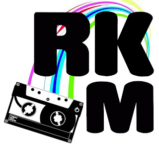
This is my logo that I created for my main task; it was produced on Photoshop. I first decided to play around with the font. I knew straight away that I wanted an informal font which would play on the fact that the magazine is for an age group of teenagers. I went through all of the fonts that were available and this one struck me immediately. It had a playful yet formal look to it which makes it able to be taken seriously and appeals to most teens.
Once the font was chosen I had to come up with the name of the magazine. From Analysing the magazines I found out that they use a simple name with either one letter like Q or a simple few letters such as NME which sound good together. Few of the magazines used long words like KERRANG. After looking at the magazines I decided to use the three letter idea. I felt it was an effective way to keep it short and make it stand out. I then found it really hard to come up with what three letters I was going to use so I went back to looking at my questionnaires. One of the most popular genres was rock; this information allowed me to use this to my advantage. I took the word rock and abbreviated it to RK. After repeatedly saying the letters out loud, I concluded that this sounded good but needed an extra letter to complete it. The next obvious letter was M for magazine. This completed the name of the magazine, RKM. The letters flow of the end of your tongue and is easy to say.
After finding the right font and name for the magazine I typed the letters separately allowing me to move them each freely without them being in one line. I really like the way that Q magazine uses a square around the letter so I wanted to recreate this in a different way on my magazine. I played around with the three letters and as you can see from the above I created a square like shape. However, I felt that there could be something else added to make it seem as though it was part of the music magazine. This was when I added the cassette image. The image was black and white which made it link to the text but I felt that it could do with something else to link it. It needed colour.
I decided that the cassette had to have the tape inside it coming out wrapping around the text somehow to make the two images link. This was hard but I came up with the idea of just one curve coming from the cassette to the K. This made it look like the tape was coming out of the cassette and wrapping around the letters. I wanted some sort of colour to be added as this is what the age group like. They are drawn into colour. This was the final element to the logo and as you can see from the image above the colour finished the logo nicely. I will be using this on my main task.
Thursday, 15 December 2011
Double page spread analysis
Kerrang Double page spread
 I like the way that this double page spread uses black and white images. This allows the text to stand out against the grey scale background. The text is red which stands out as it links to the bands style. The band uses the colours red, white and black and I like the way that this is represented in the spread. The page has used a images with a black background and the way that it uses this to its advantage draws me in. It takes the image and blends it by making one of the side completely back and the other with the image. One dislike is the use of the white bar in the right hand corner; it distracts the eye of the reader and takes away the focus of the article. There are more images than text which makes me ask what will my audience want. I will have to come to some conclusions by analysing my questionnaires.
NME double page spread
I really like the title that this magazine uses. Its very bold and makes the strory look interesting to read. It grabs the reader in and helps add the feel to the magazine. This magazine also uses the images background to use on the other page which means I may have to think about this with creating my own.
MOJO double page spread

The way that this image is in black and white really appeals to me as I like the whole feel of it having no colour and really just seeing the image as its self. Another thing that makes me interested in this magazine is the tittle. I like the way that the text picks out the main words and puts them in a different colour. This makes them stand out against the black background.
Q double page spread

I really like the way that this magazine has used a gigantic L that covers the whole page for the first letter of the article. It stands out and draws you into reading the magazine. This magazine uses a picture on the left but doesn't make it appear to be part of the article on the right. This makes it different from any other magazine.
Vibe double page spread

This magazine appeals to me in the simple fact that it is pure creativity; being an art student I am looking to be very creative in creating my magazine. The idea used of drawing onto the person adds a feeling of him being part of the article. The tittle is very bold as it has used a handwriting style. This magazine will be one of my favourites to take ideas from.
Thursday, 1 December 2011
Questionaire results
Quetsionaire research

After getting back all of my 30 questionnaires I decided that to collate my findings I should put them into graphs. I decided that a pie chart was the most easiest one to read. This is only 4 of the 10 questions I asked. I found out that there was more males than females, however there was roughly half and half. I then discovered that my main age group would be the 15-16 one as I surveyed more of this age group. the next question was what type of music magazines do you usually buy? this allowed me to find out that most people chose the option other. however the second top choice was kerrang. this information shows that I may need to analyse different magazines. This was also the case for how often do you buy magazines? many people said that they didn't buy magazines on a regular bases therefore i will have to think about this when I create my own.
Tuesday, 29 November 2011
MOJO magazine
MOJO magazine

The MOJO magazine was like the others and used the colour scheme of red, black and white. I really like the way that the image is black and white and the titles are in red because it makes the sub title stand out. I also like the way that the image doesn't have any writing over it apart from the name of the magazine really appeals to me as it makes the image seem to be very important rather than being hidden by text. I think the font of the "Michael Jackson" links very well to the story. Michael Jackson was very popular in his childhood and this is shown through the old writing tape that both i and older generations would associate with as an old retro theme.
The contents of the magazine is very unique and I like this. by putting the pictures in a collage like way carries the theme from the front cover into the mag. when I was younger a scrap book was in every ones homes. the theme of the tape is also repeated onto the contents page.I like the way that the MOJO is very bold and is in black because it makes it stand out.

The MOJO magazine was like the others and used the colour scheme of red, black and white. I really like the way that the image is black and white and the titles are in red because it makes the sub title stand out. I also like the way that the image doesn't have any writing over it apart from the name of the magazine really appeals to me as it makes the image seem to be very important rather than being hidden by text. I think the font of the "Michael Jackson" links very well to the story. Michael Jackson was very popular in his childhood and this is shown through the old writing tape that both i and older generations would associate with as an old retro theme.
contents

The contents of the magazine is very unique and I like this. by putting the pictures in a collage like way carries the theme from the front cover into the mag. when I was younger a scrap book was in every ones homes. the theme of the tape is also repeated onto the contents page.I like the way that the MOJO is very bold and is in black because it makes it stand out.
Friday, 18 November 2011
Logo ideas for preliminary task

Tuesday, 15 November 2011
Logo
I cant use the school logo due to copy right issues and I feel that I could make my own logo look extremely better; it will also give me a chance to practice for my main task. Seeing as though I took art at both GCSE and AS I feel that I should bring this element into my media work. This gives me the availability to look at both planning my magazine and creating logos. To create my logo I will have to think about what it is my magazine is about and then draw ideas from this. To include the skills I have learnt in art I will try to draw out basic logos and magazine plans and images I wish to recreate with the camera. I will then scan them into my computer and edit them on Photoshop.
Subscribe to:
Posts (Atom)